Get in Touch!


I designed and built the logo, brand identity, website and various digital and print promotional materials for Tables Without Borders, a non-profit dinner series benefitting refugee chefs in Washington, D.C. The event raised more than $20,000 for refugees and asylum-seekers, and was covered by the Washington Post, NPR, ABC News and NowThis, among others.
I’ve continued to grow the brand identity and maintain the site as the program moved from an initial event to a partnership with Hilton. You can read a full write-up of my process for the branding aspects of this project below and on Medium.
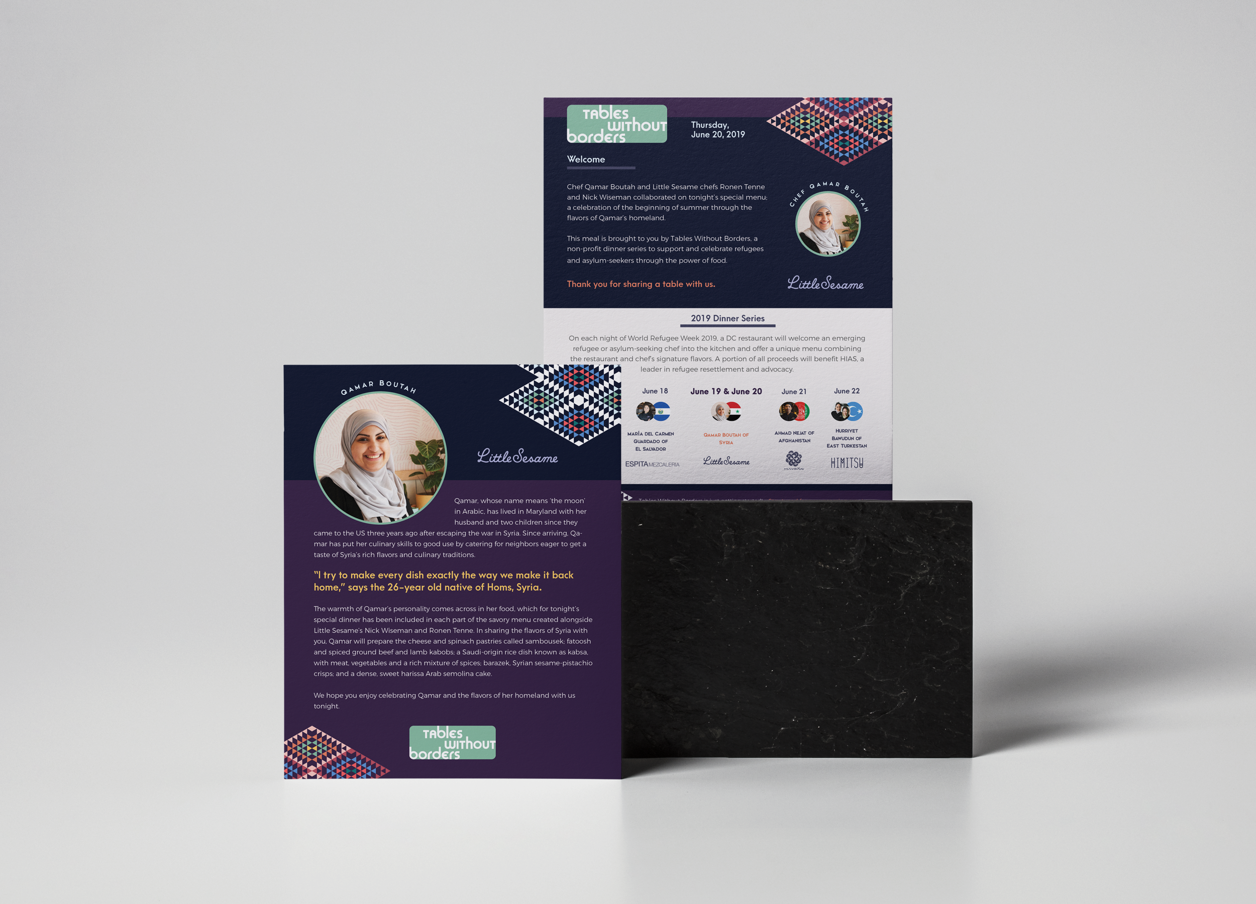
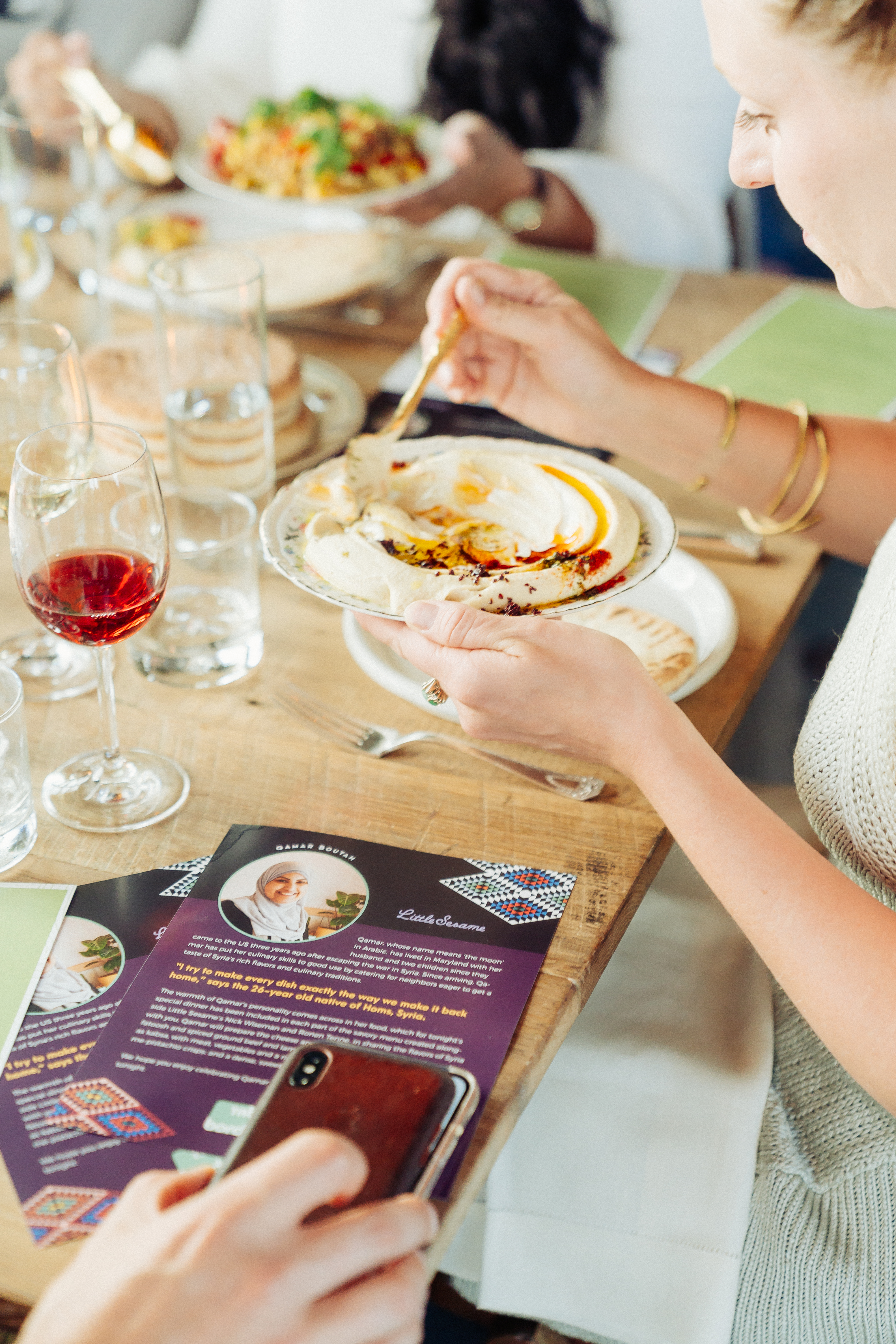
Photo by Timothy Eugene
The event took place over six nights across some of D.C.’s most popular restaurants, where refugee chefs collaborated with head chefs to craft a menu representative of their home cuisine. A portion of the proceeds from each night, as well as the total donations raised, went to refugee resettlement organization HIAS and the participating refugee chefs.
The goal was to empower refugees with culinary experience, aid in the difficult resettlement process, and foster community through food.
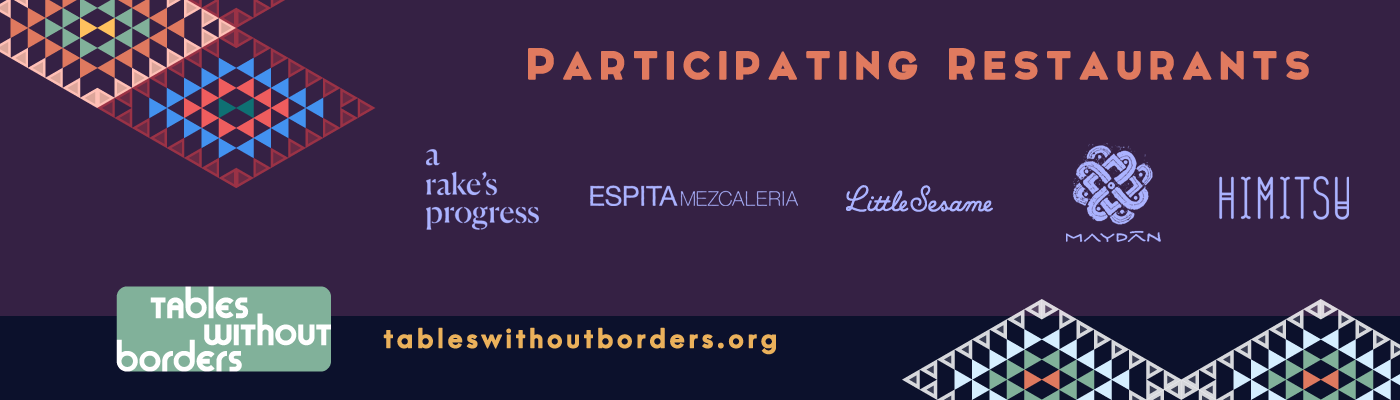
Tables Without Borders partnered with five of DC's most popular restuarants for the summer event.
The brand had to appeal to these four different audiences chronologically:
Each one of these groups had to be accommodated in unique ways during different stages of the project.
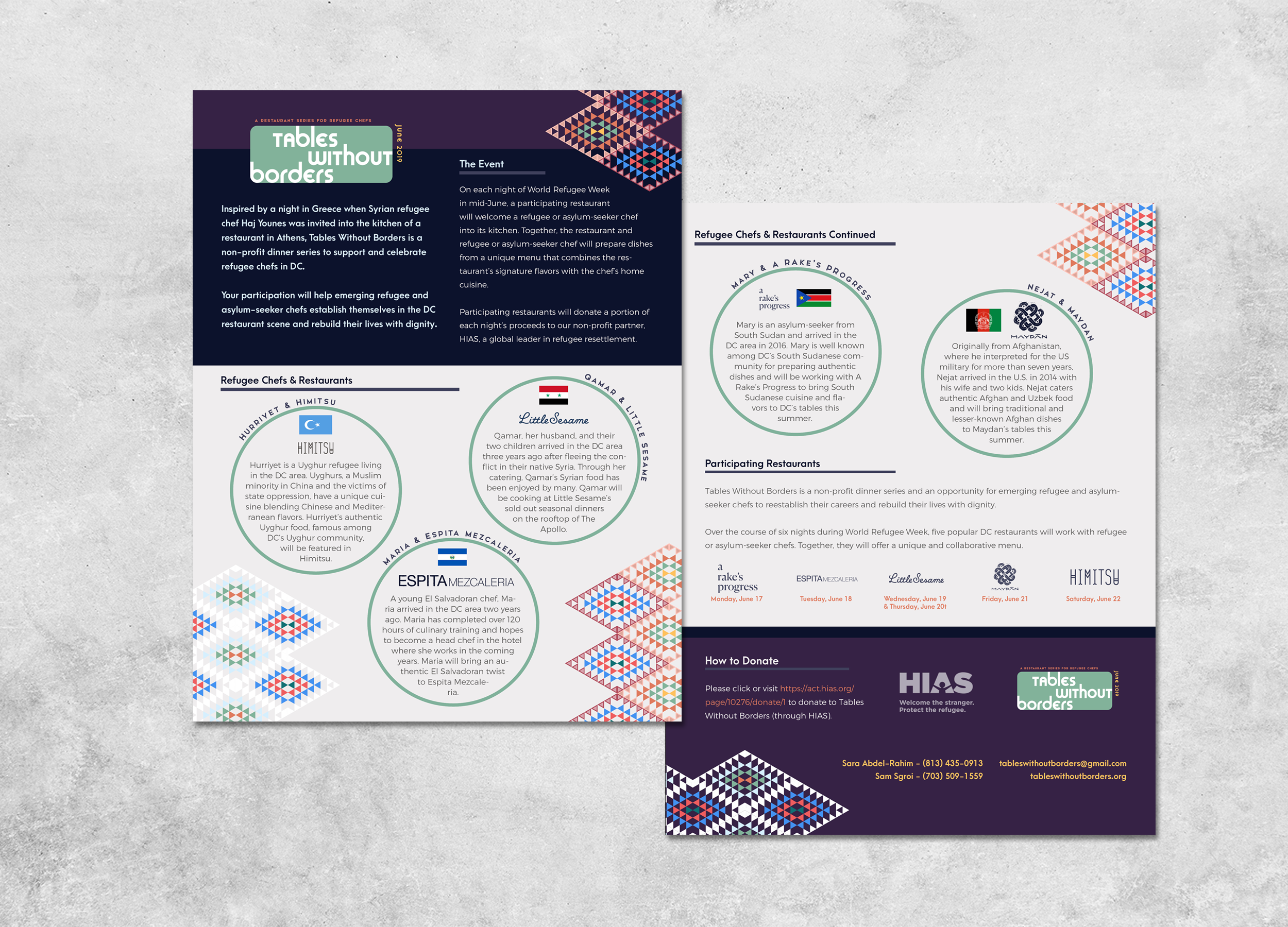
Event summary one pagers that were used with restaurants and prospective donors.
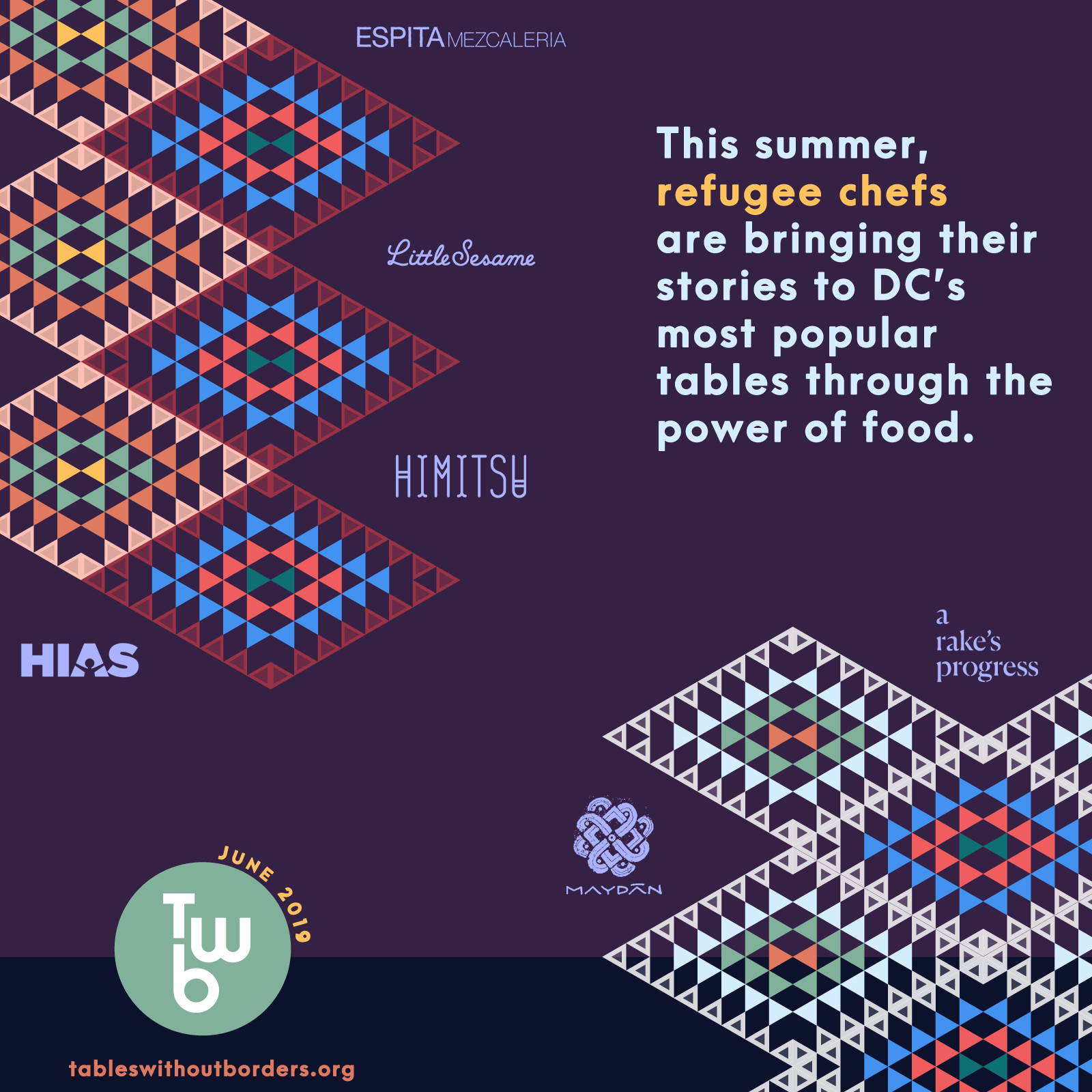
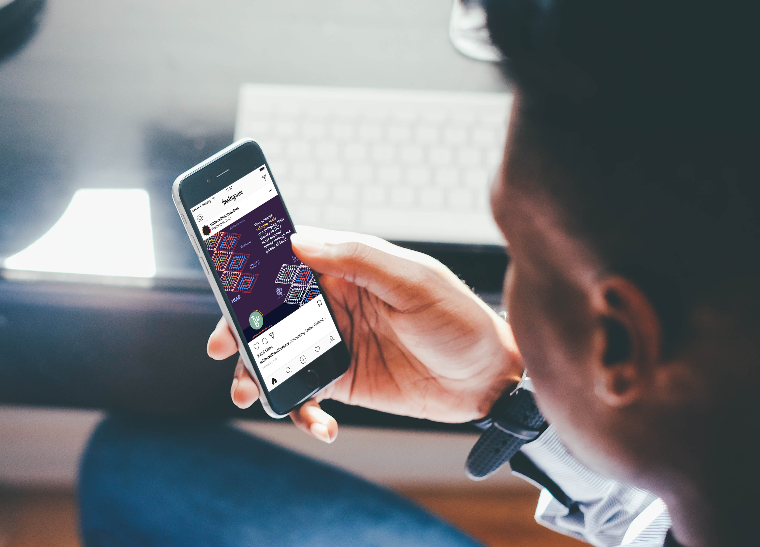
Social media posts had to tell the interconnected story of the event.
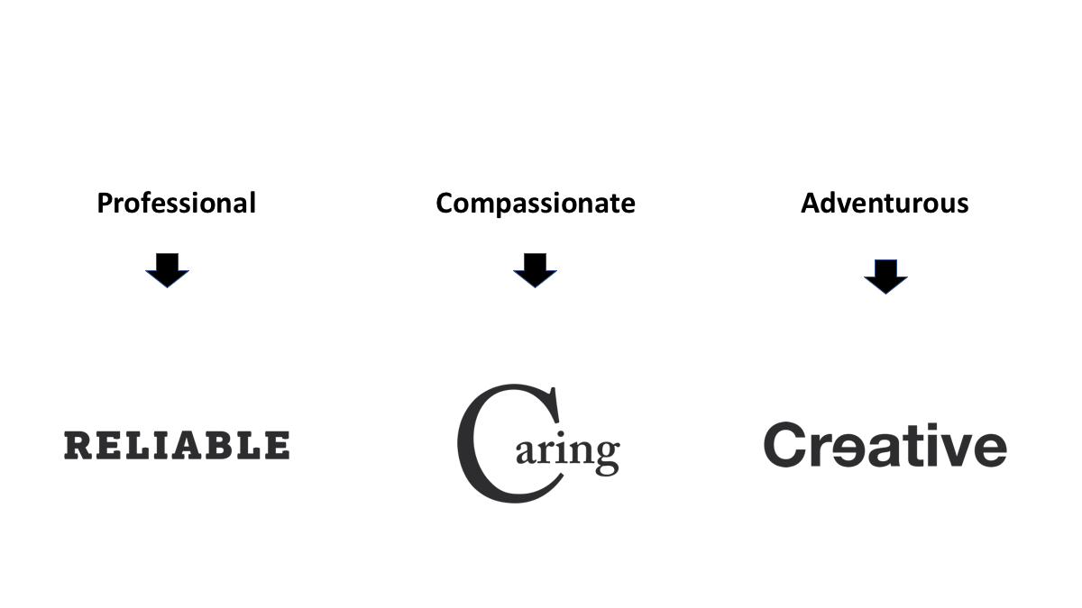
As is the case with many bootstrapped fundraisers, I was the sole designer on the project. However, I had the luxury of connecting with the event organizers early in the planning process and in the nascent stages of defining the brand. I worked with them to choose three main values they wanted to convey:
From there, I translated these ideas to visual concepts based on widely established design conventions: slab serifs are trustworthy, swooping lines and humanist serifs are soft and approachable.
Brand values translated to visual conventions.
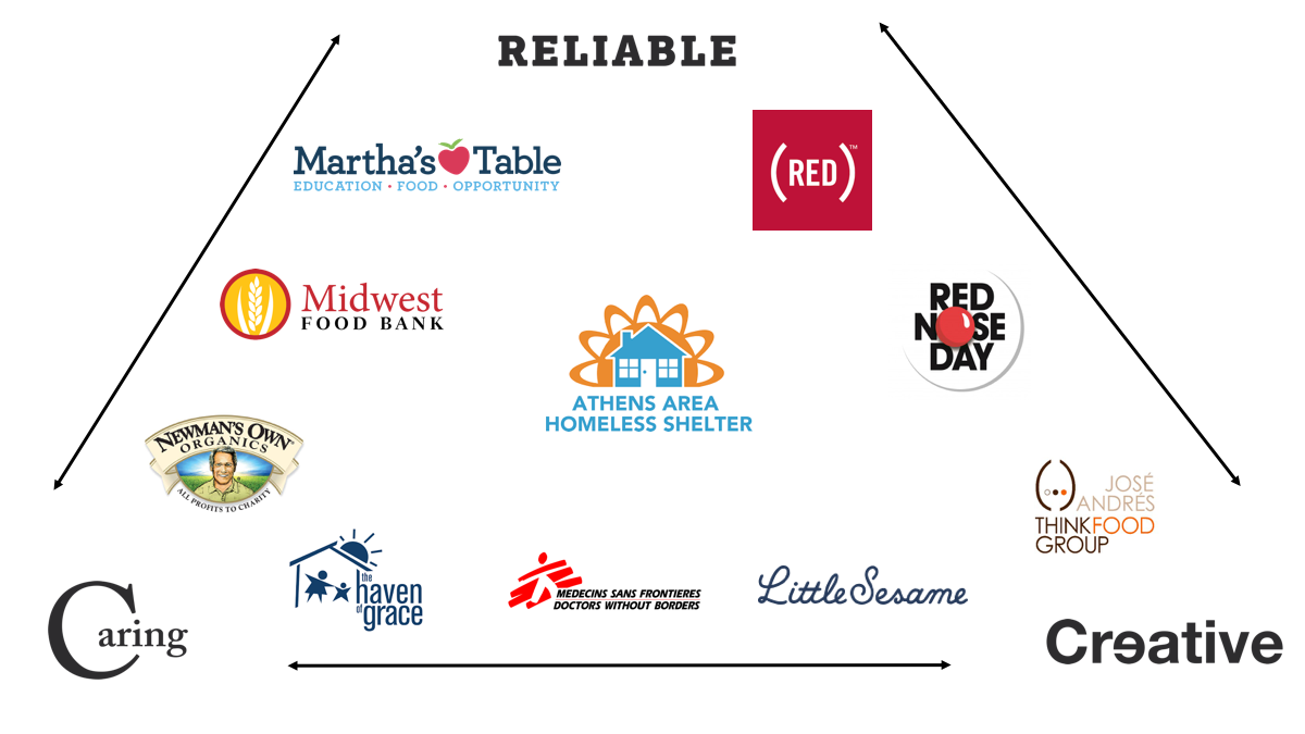
Research plotted across relevant visual conventions.
Next, I did research on logo marks in adjacent spaces that invoked these values, and plotted them across the brand values on a 3-point axis. I wanted whatever mark I made to be able to sit seamlessly alongside these logos.
I also made a particular effort to incorporate local businesses as reference points whenever possible, given that this was a local event with an express focus on the surrounding community.
After exploring several different approaches, I presented the five options below.
Final five logo options.
The stakeholders and I narrowed it down to the two shown here.
The two finalists: rounded rectangle retro (just look at that 'e') vs. hand-drawn letter pun fun.
Both logos also had a strong visual pun that built off the name nicely. In the end I opted, because I felt that it more accurately represented the brand’s values and the visual language I wanted to employ in service of those values.
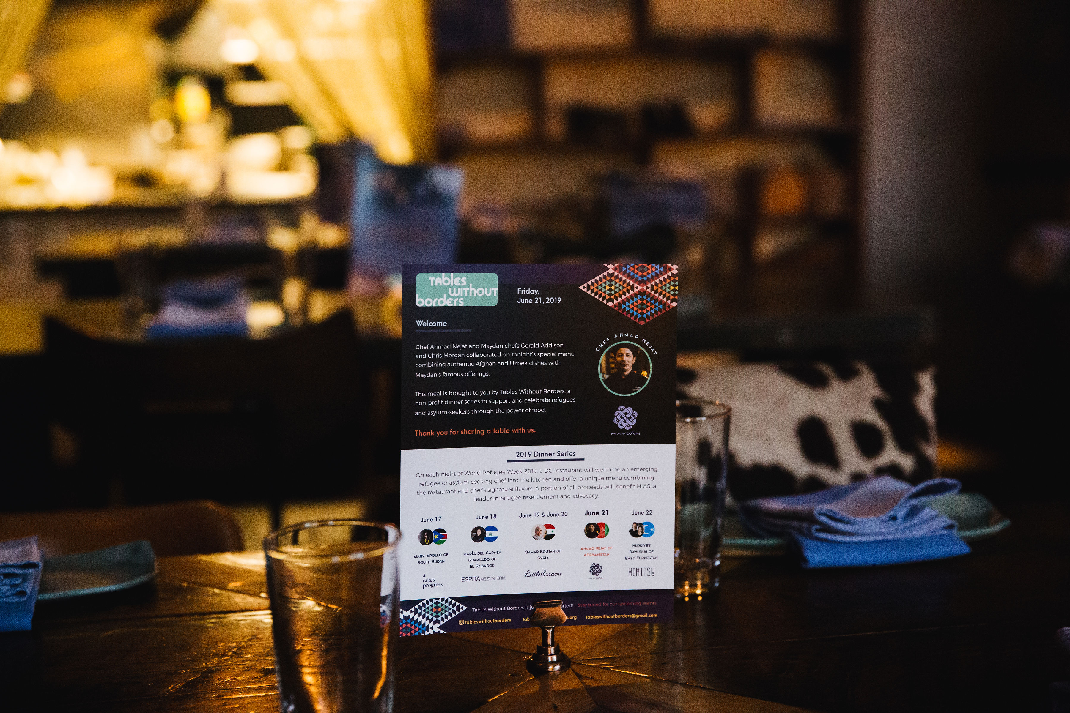
Night of the event flyers in use at Maydan. Photo by Maya Oren.
While the hand drawn style is compelling for the non-profit world, and becoming more and more prevalent in professional contexts, it requires careful consideration of illustration styles to retain respectability and consistency. The final logo satisfied enough of the adventurous and compassionate characteristics through an eccentric typeface and visual representation of lacking borders, but it’s also bolder, geometric and more conducive to a grid system.
In addition, I liked being able to alternate using the logo as a compound shape depending on the background, and the way that relevant event information could accompany the logo in different contexts.
Example of how the logo could interact with other elements as a compound shape.
The next step was to bring the logo to life with a flexible identity system capable of accommodating the wide variety of intended audiences. I was immediately drawn to the following ideas:
My first approach was quite literal, using table patterns similar to those you might see on catering and event plans.
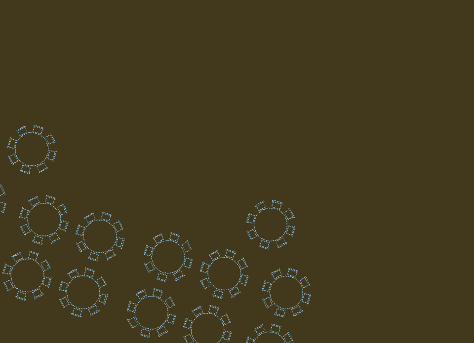
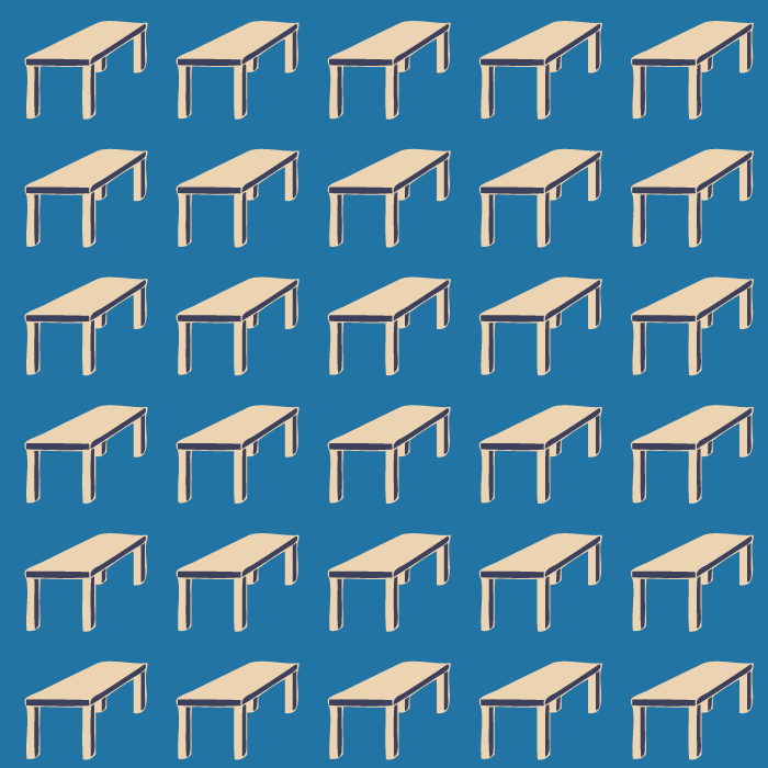
Patterns that got tabled.
I’m confident I could have built this concept out to be visually appealing, but I quickly realized that this wasn’t conveying the message we needed. And putting the tables at the center of the brand –which represents where all these different groups meet — isn’t the real goal of the event. The focus was supposed to be on the refugees and asylum-seekers, and their culture.
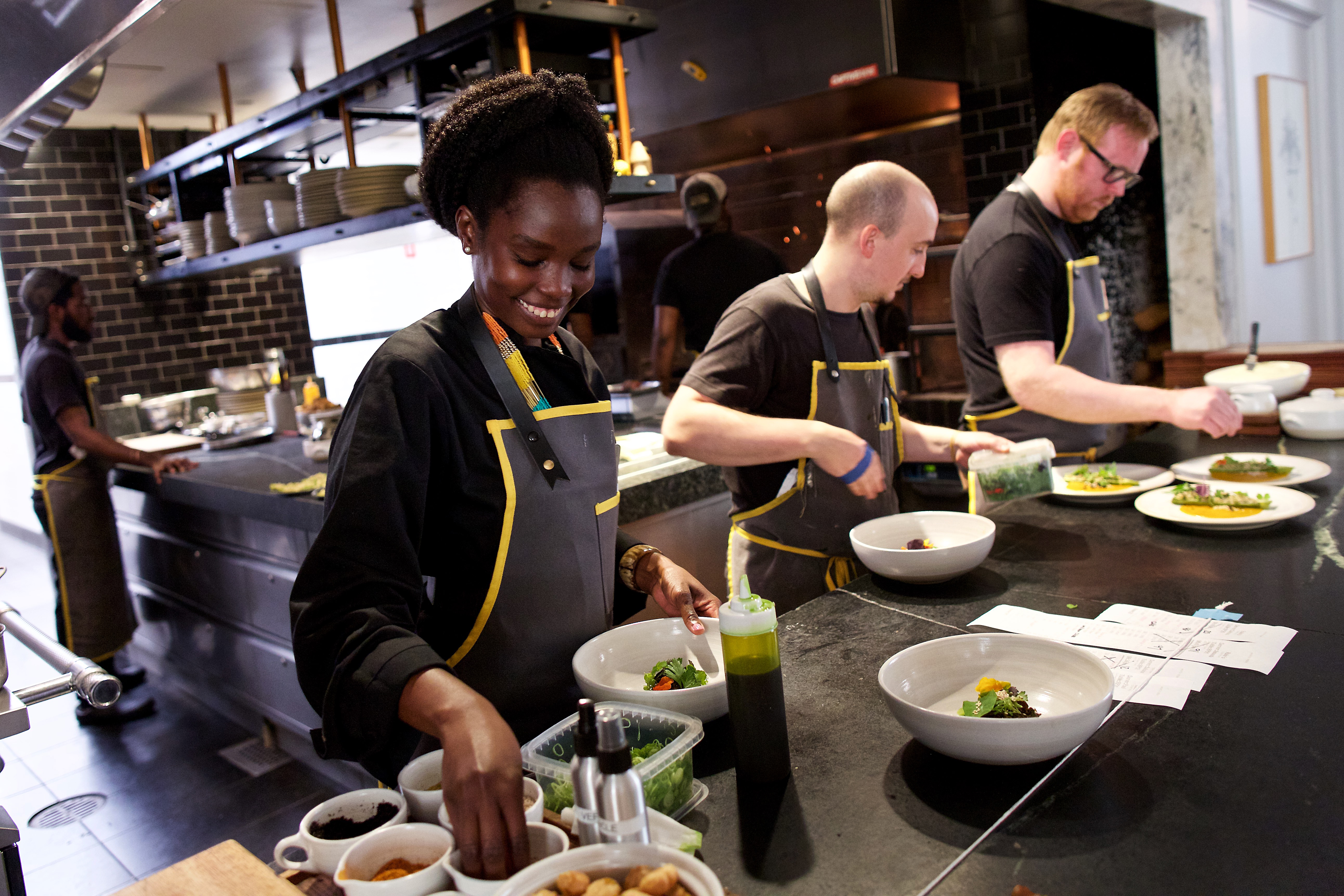
Chef Mary of South Sudan in the kitchen at A Rake’s Progress. Photo by Deb Lindsey.
So I went back to the drawing board. Recognizing that TWB was striving to work with chefs of all nationalities, I needed a pattern that was going to be culturally ambiguous but still representative of everyone involved. One thing that all refugees and asylum-seekers have in common is movement; they’ve all immigrated in search of community and a safer or better situation.
The simplest visual way to represent movement is a triangle. It’s a dynamic geometric shape that contrasts the rounded edges of the logo nicely. So I started there, building out triangle patterns, before choosing one that pointed triangles inwards towards each other, representing the unity and coming together facilitated by the event.
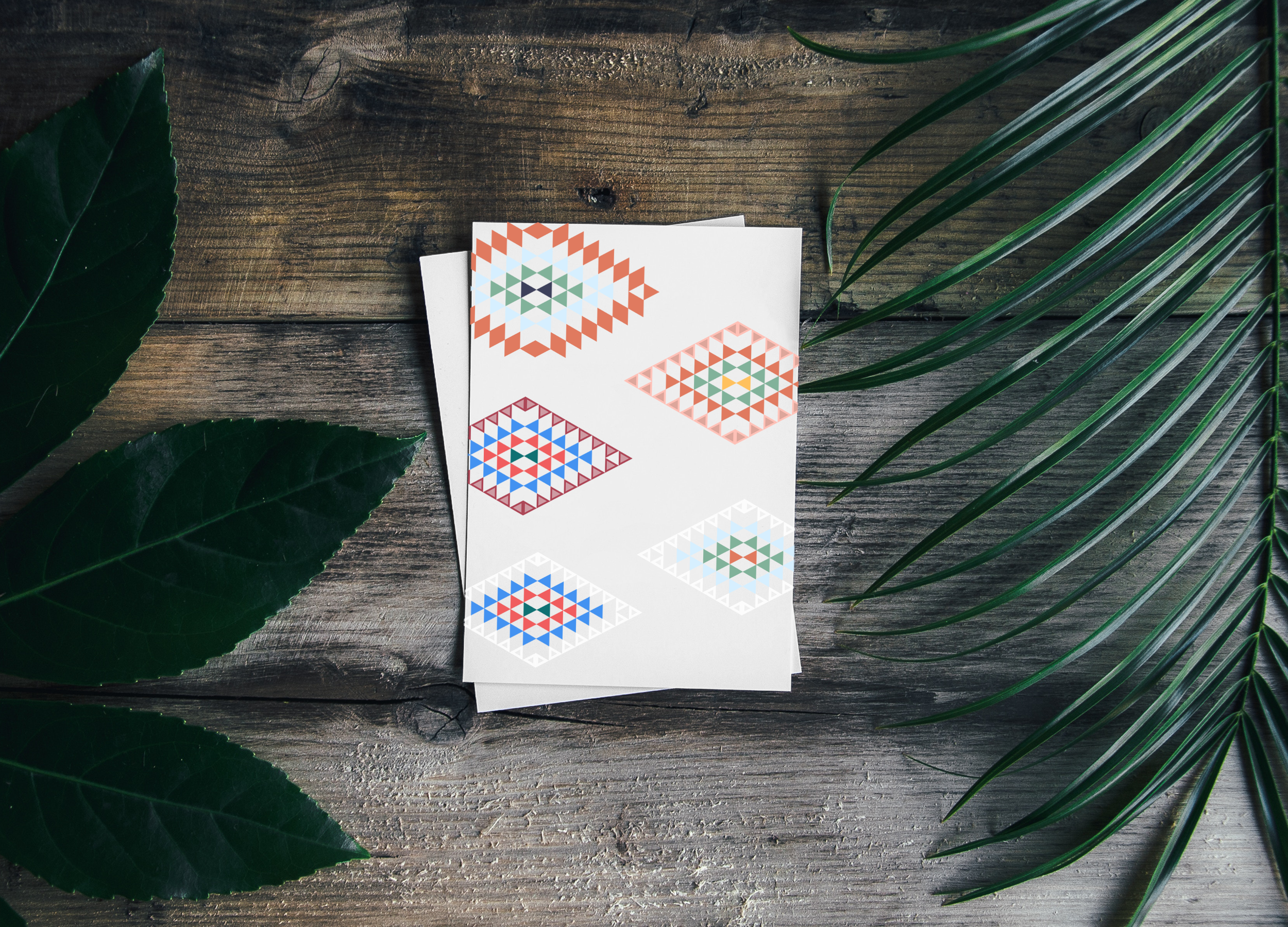
Picking patterns.
I experimented with warm, earthy color palettes before finding one that felt diverse, but still cohesive with the logo. The purple background was the final touch before moving to typography and building out a brand identity system.
At every point of the process, I tried to keep the core brand values central. In the name of balancing professionalism, compassion and adventure, I opted for a crisp, super legible sans-serif for headers, the workhorse Montserrat with reduced weight for the body copy, and a striking, eccentric display type for CTA’s.
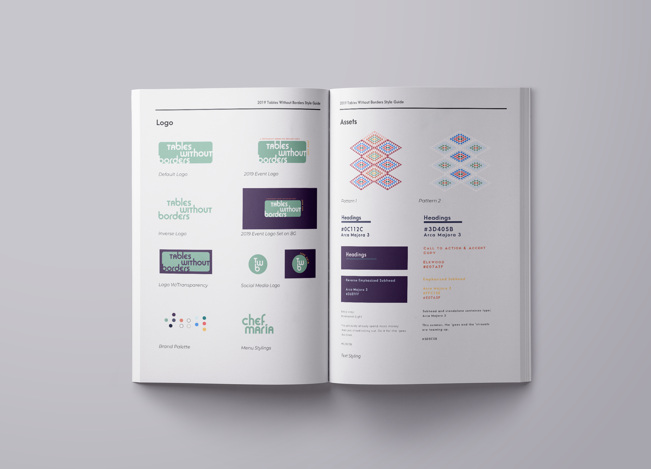
Brand identity and style guidelines.
Once the brand system was finalized, it was time to apply it across a website and various print and digital promotional materials. When the site first launched, none of the event details and logistics had been finalized, and the main goal of the site was to drive donors to the HIAS-supported donor page.
Giving information about the event in an appealing way was necessary to provide context for that call to action, but I wanted to keep the site conversion focused. So I built a one-page site with a menu that smooth-scrolls on click. The first iteration of the site dedicated the most real estate to the chefs, in keeping with the focus of the event.
Post event, the site aims to promote upcoming events and partnerships, as well as archive previous events for grant applications and soliciting donations.
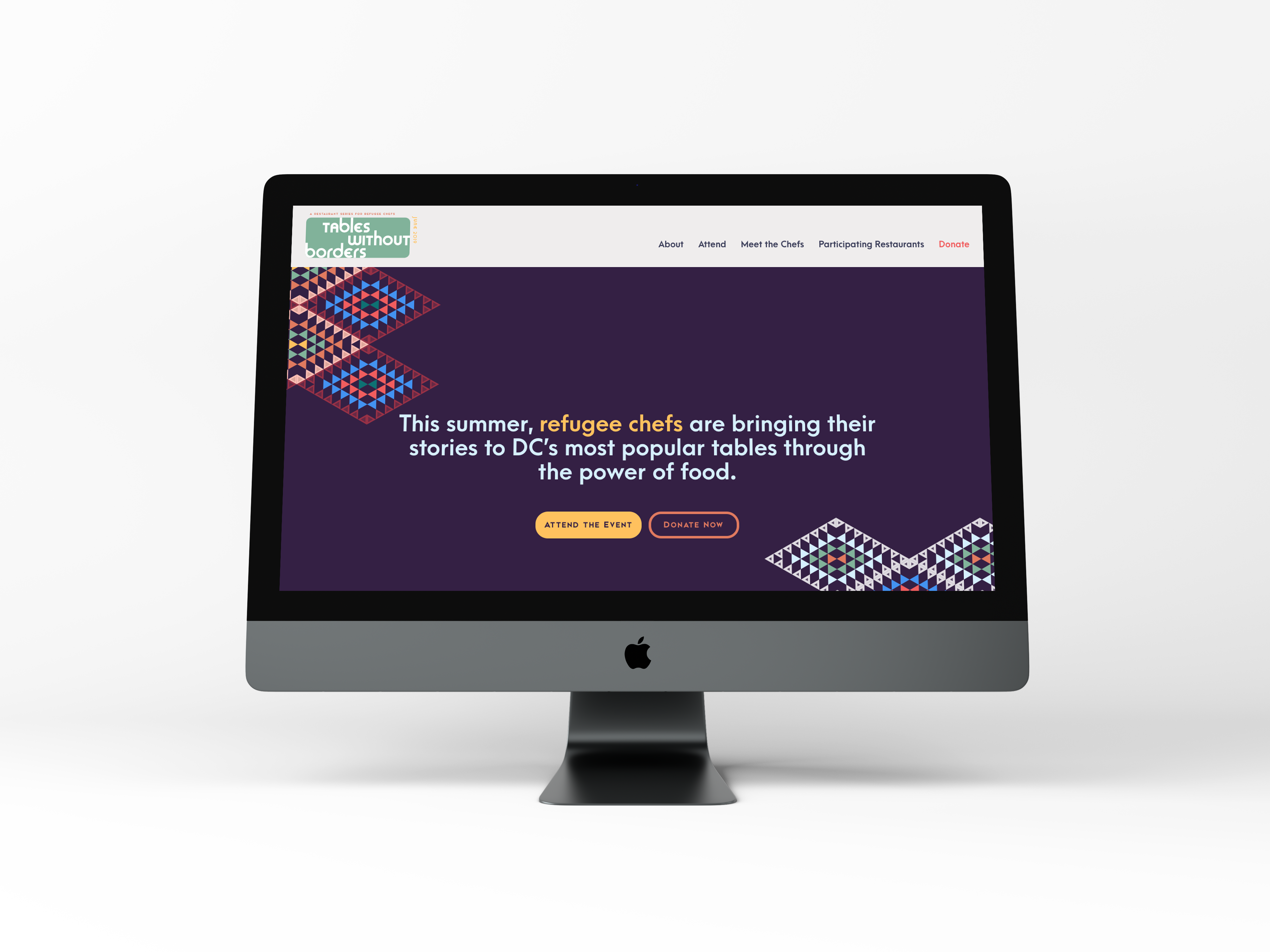
See it at tableswithoutborders.org.
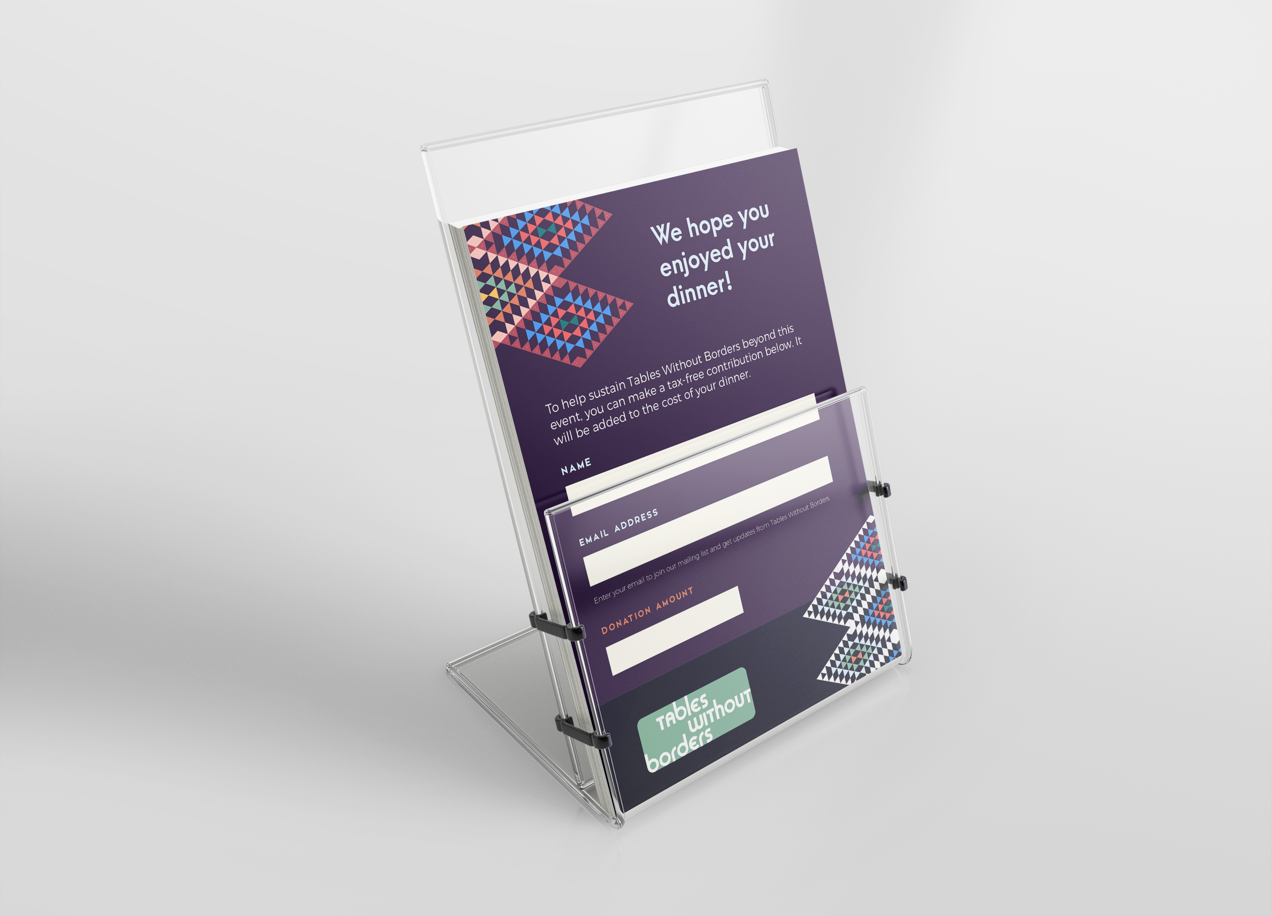
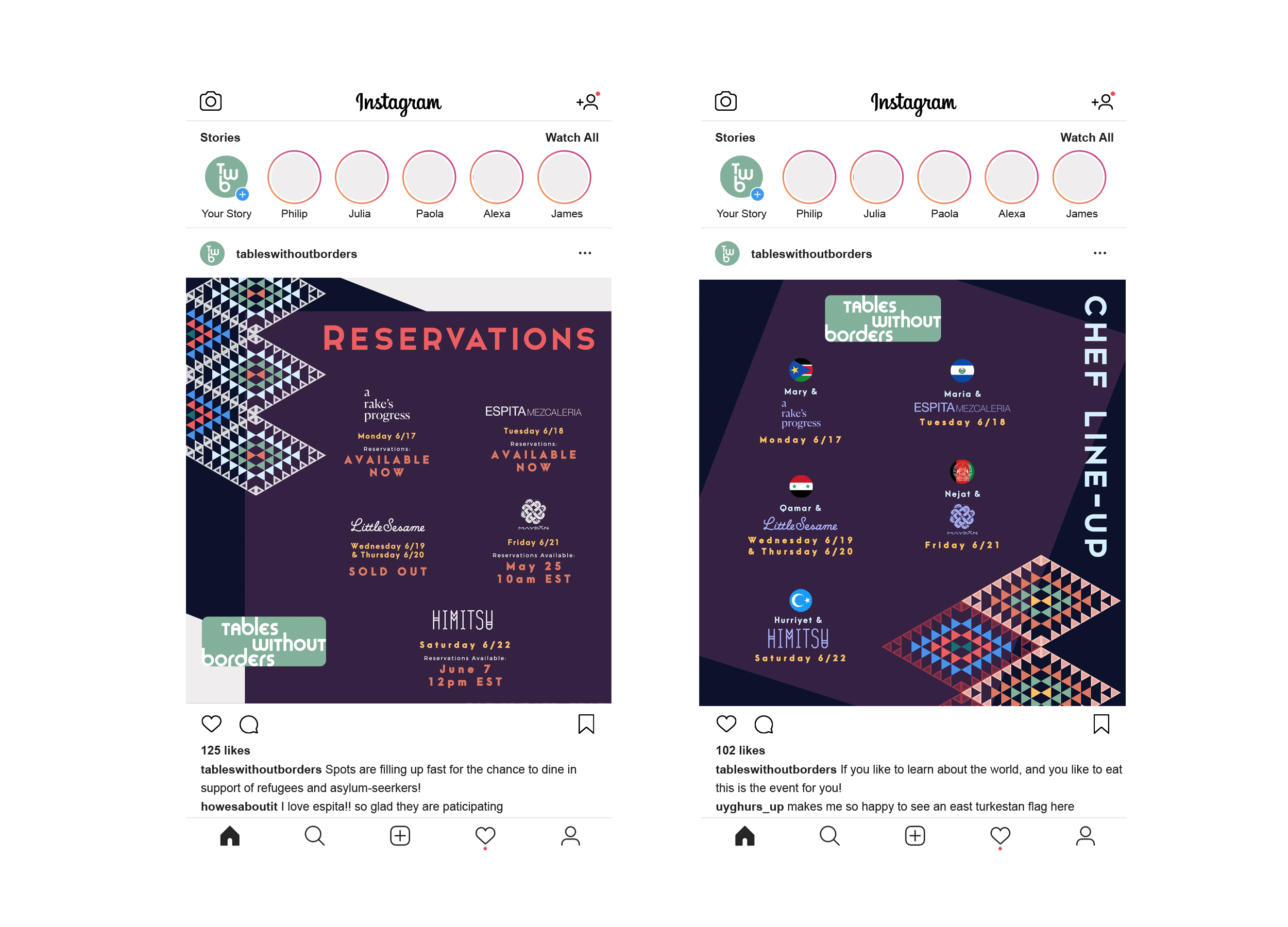
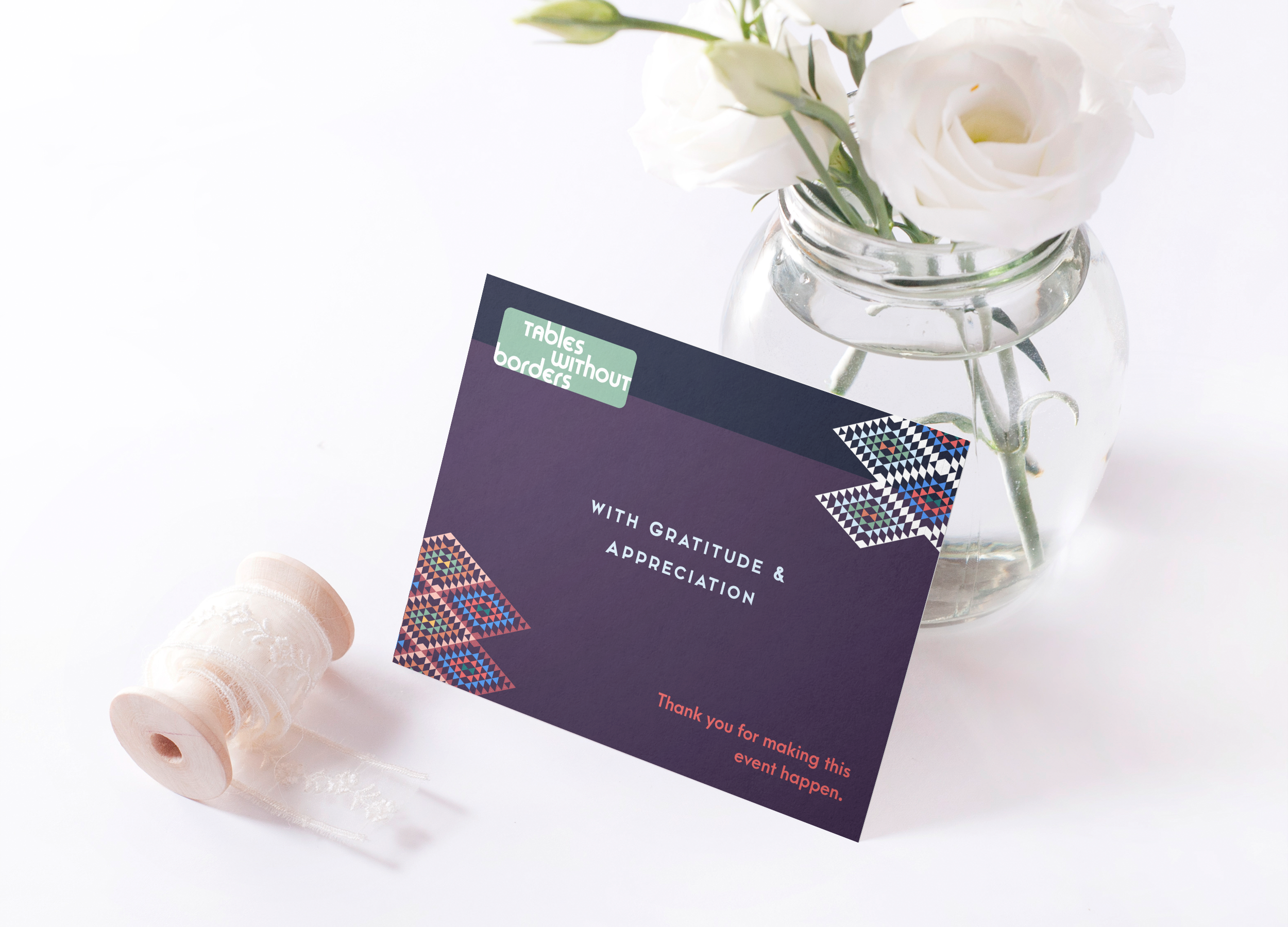
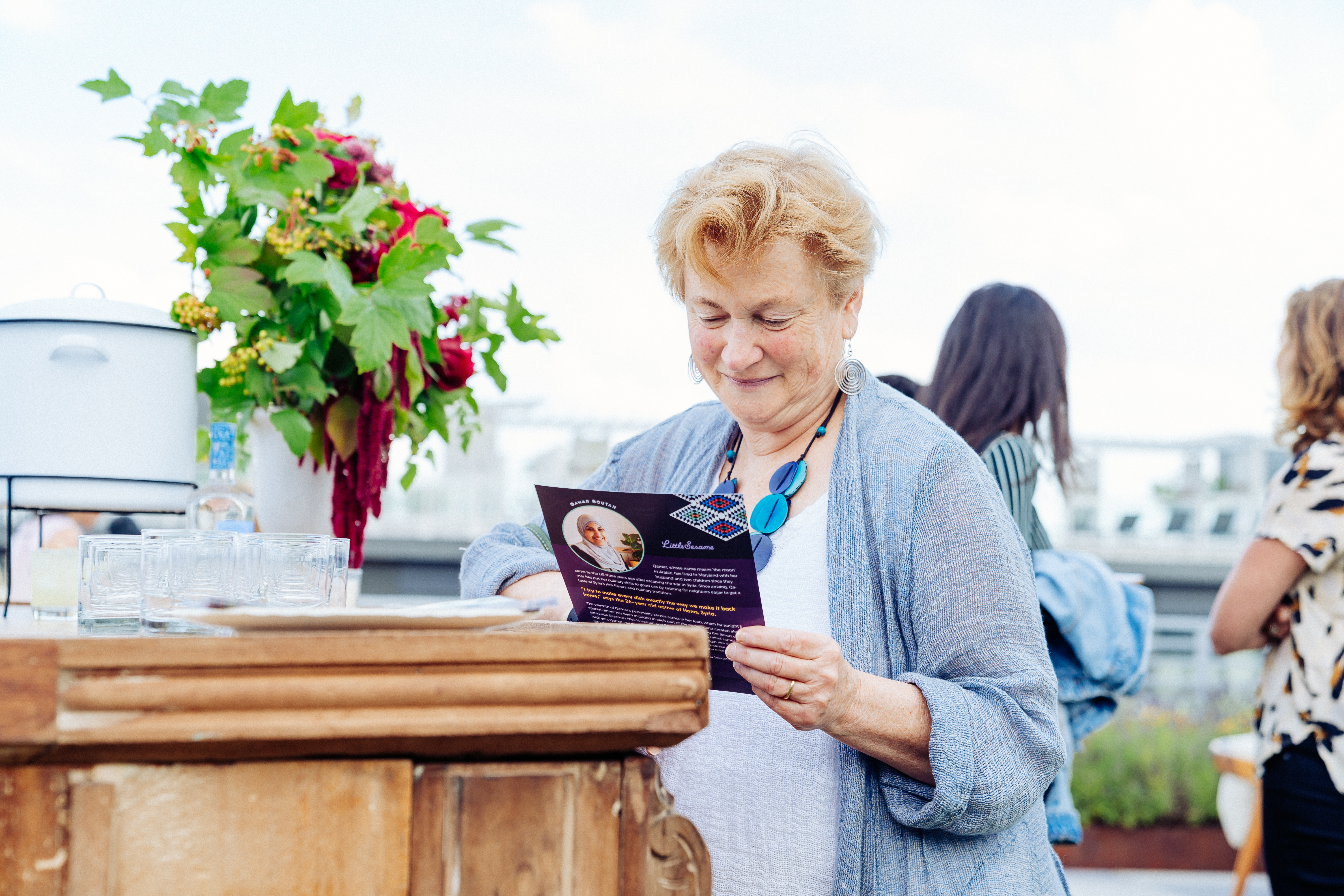
Photo by Timothy Eugene
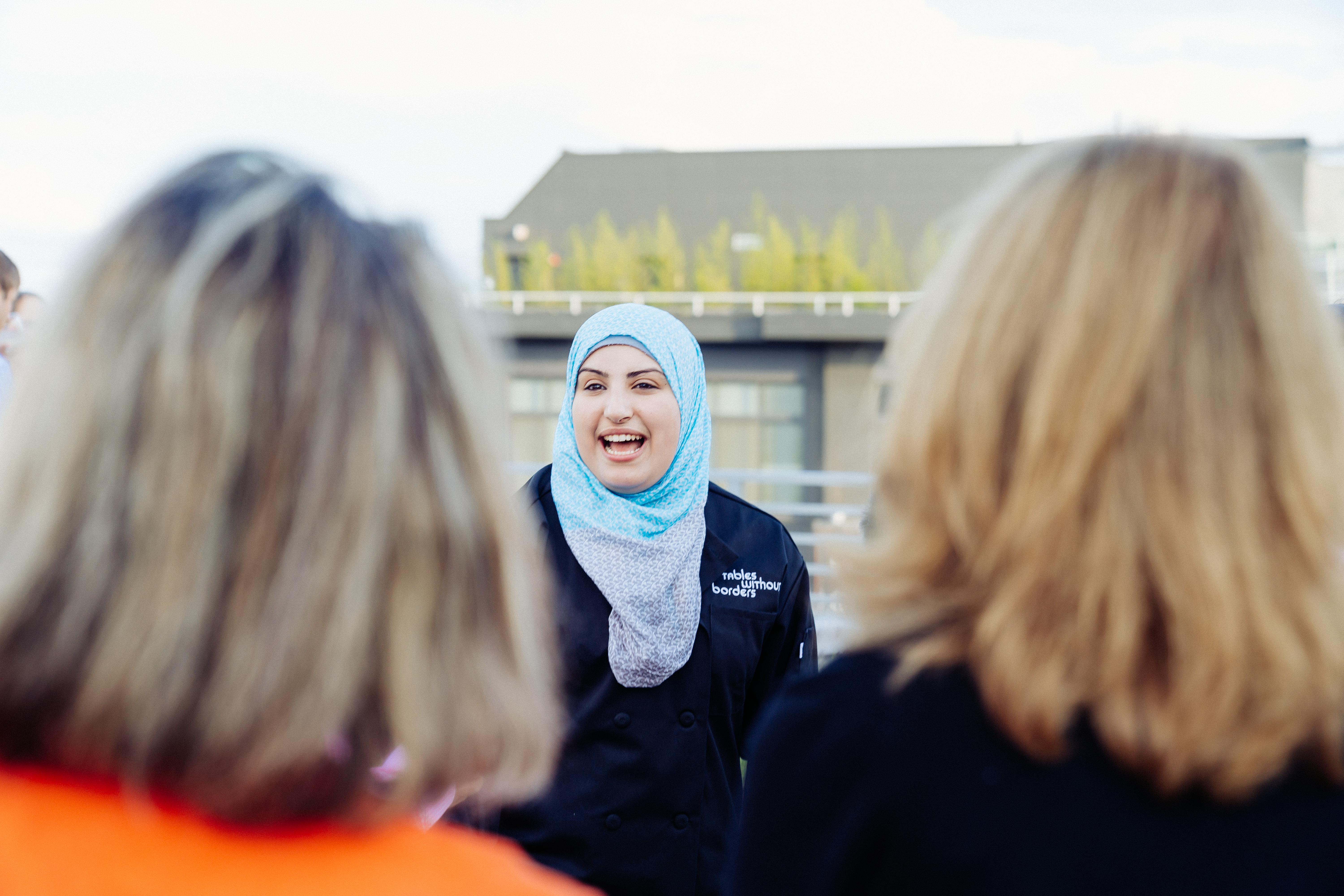
Photo by Timothy Eugene
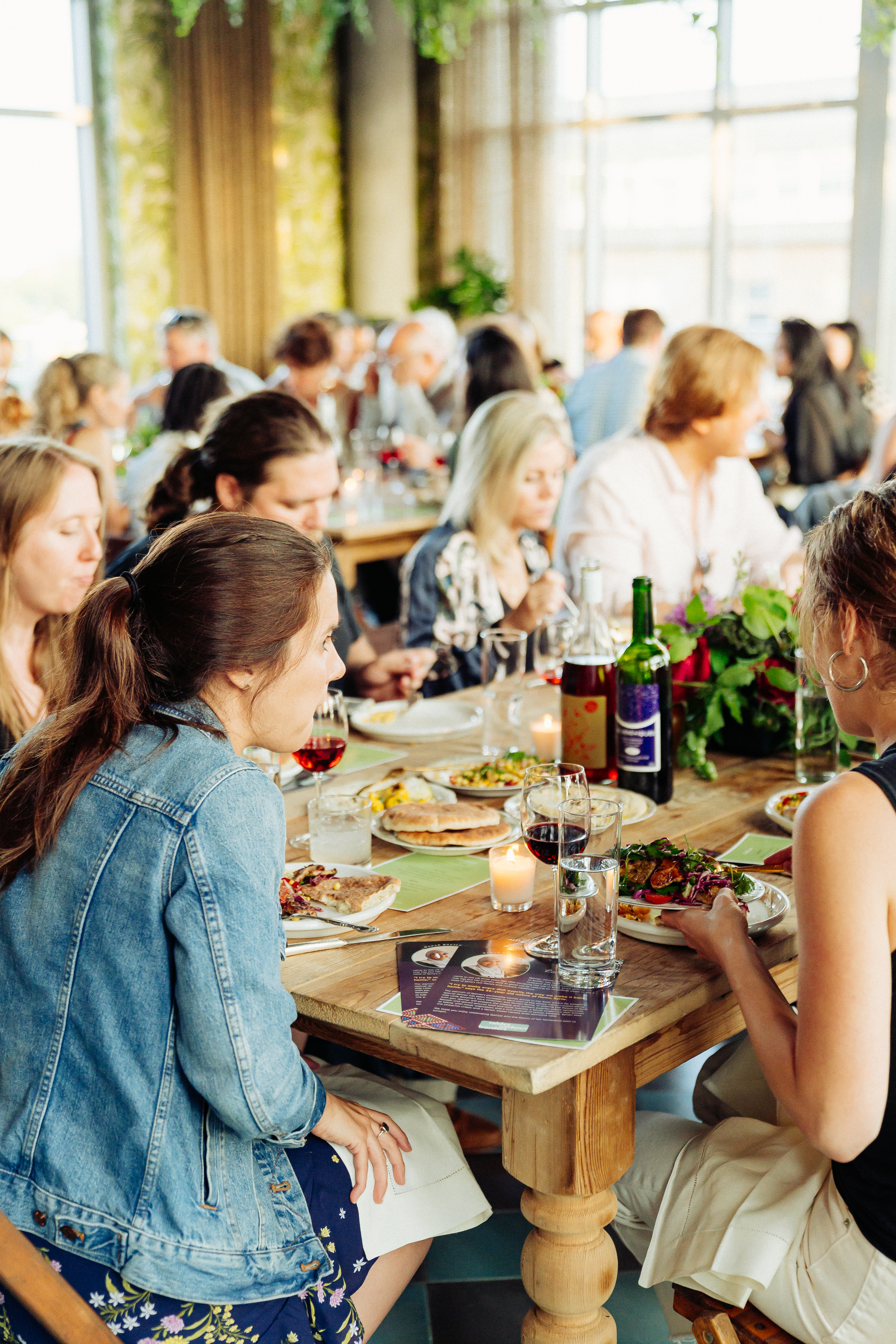
Photo by Timothy Eugene
Photo by Deb Lindsey
.jpg)
Photo by Timothy Eugene
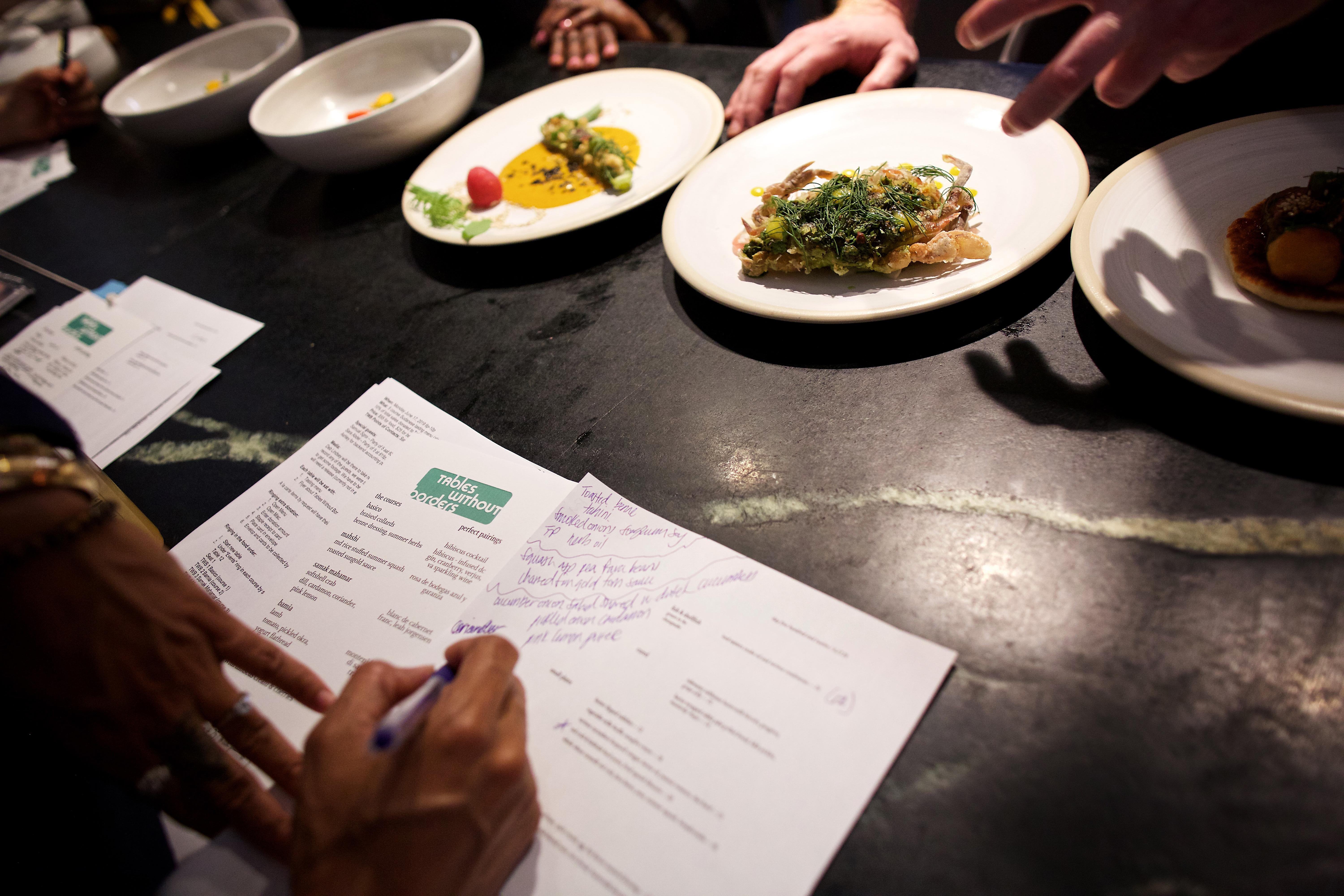
Photo by Deb Lindsey
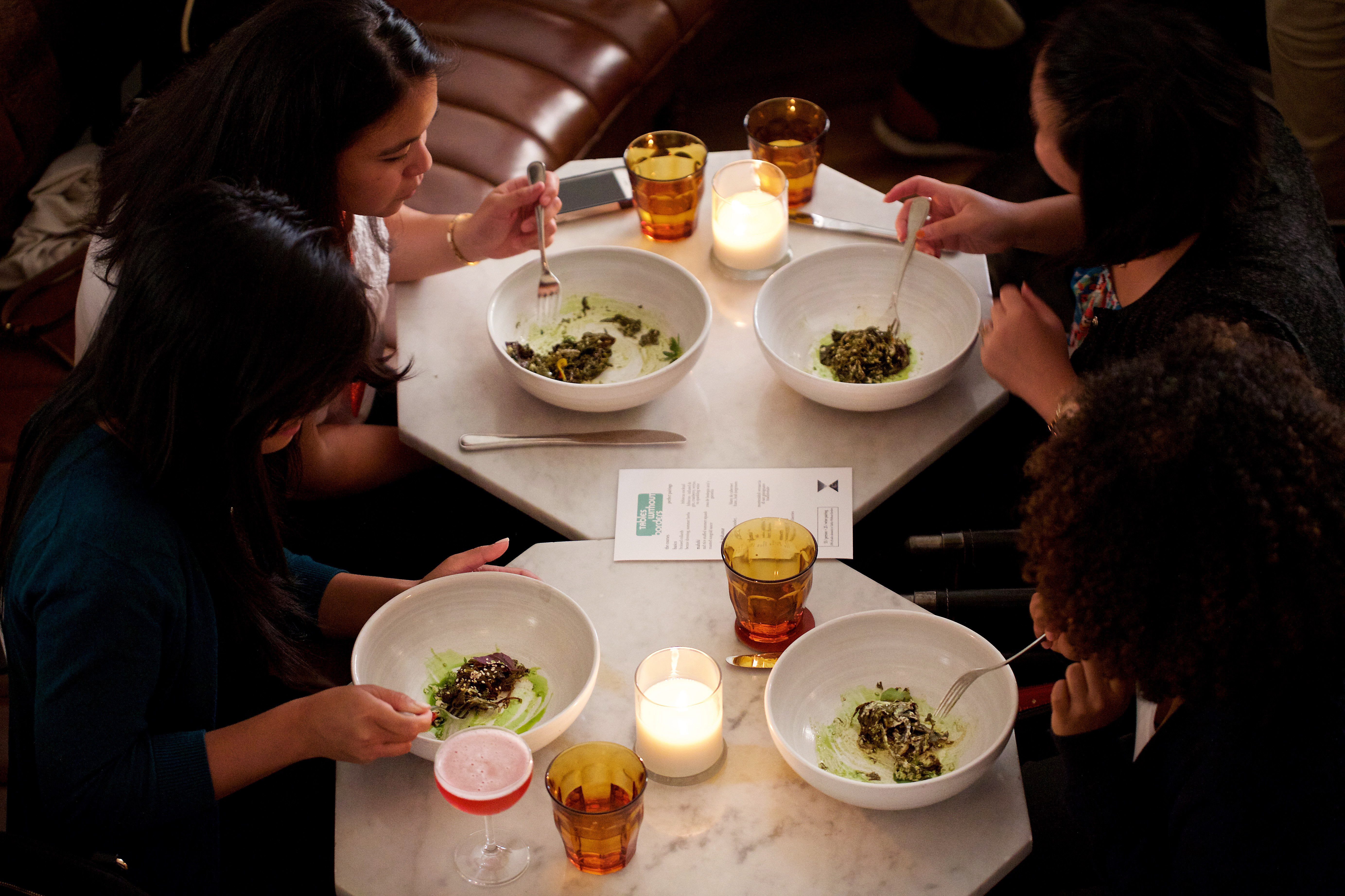
Photo by Deb Lindsey
about this site